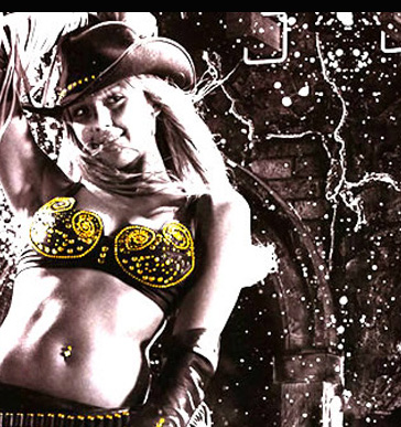
Dotted throughout cinematic history are films which boldly combine black and white with colour, occasionally within the same frame. An aesthetically arresting technique – although it draws attention to the artifice and manipulations of cinema – done effectively it can be a symbolic shift which enhances our understanding of character psychology and theme. This is colour as a state of mind.
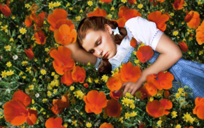
The Wizard of Oz (1939) Dir. Victor Fleming
As she gazes up hopefully into the sepia sky of Kansas, Dorothy Gale (Judy Garland) famously trills, “Somewhere over the rainbow skies are blue”. Seemingly transported to the magical land of Oz during a ferocious twister, she opens her front door to a blinding Technicolor world. Arguably the most memorable use of colour in the history of cinema, its dreamy landscapes sing with now iconic colour-schemes. This is the world of ‘the yellow brick road’, ‘the emerald city’, and ‘the ruby slippers’. It is a gleefully askew fantasy, with the use of hyper-real colour an overt nod to Oz’s existence only in the mind of its young protagonist. Colour achieves an increased significance given the context of the short sepia sequences which bookend her journey. In part an ode to rural values, in The Wizard of Oz Dorothy learns to appreciate the warmth and simplicity of her sepia-hued homeland, which is revealed as being ultimately preferable to the thrilling, garish, dangerous and phoney city of Oz.
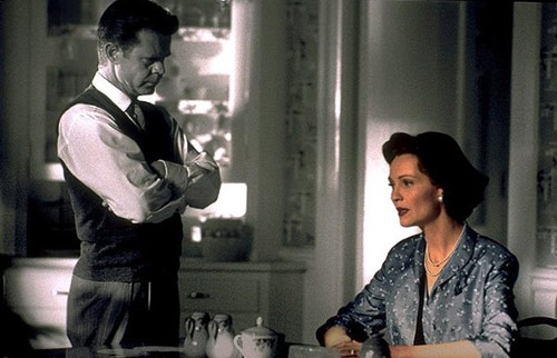
Pleasantville (1998) Dir. Gary Ross
When two teenagers are magically transported into the innocent 50s sitcom of the title, their modern influence ripples through the black and white town and colour begins to spring up
both on objects and people: pink blossom; a neon jukebox; the pages of an art book bursting to life with images. Pleasantville uses colour to express sexual liberation, creativity and the acquisition of knowledge. Perceived as a dangerous development by the town’s establishment, the racial slur “coloured” is used scathingly to describe those who have succumbed to the phenomenon.

The Picture of Dorian Gray (1945) Dir. Albert Lewin
This neglected gem of an adaptation uses colour fleetingly but disarmingly amidst elegant black and white to depict the transformation of Dorian Gray’s remarkable portrait. Firstly, we bear witness to its vibrant perfection and subsequently it is presented to us in all its ghastly, corrupted glory. In the intervening years the painting has absorbed the ravages of Dorian’s aging and excess. It has caught and captured his disintegration; allowing him to display an untarnished, eternally youthful facade. Only a broad palette is sufficient to convey the painting’s true horror: the scope and potency of Dorian’s wickedness, the full spectrum of his depravity. The triumphant shift from black and white to colour allows the reveals to register with audiences as genuinely gob-smacking.

A Matter of Life & Death (1946) Dir. Michael Powell and Emeric Pressburger
After improbably surviving a plunge from an aircraft, Squadron Leader Peter Carter (David Niven) comes to believe he was destined for death but has been missed in the fog by the conductor assigned to escort him to heaven. Heaven itself appears in black and white and is artfully imagined as a vast expressionist production line. In the hours since the incident Peter has found love with a young American woman, June. Through Peter’s celestial court appeal, the film makes a case for the oft ignored passionate side of an Englishman’s character. It is a glorious England depicted in lustrous colour – seen through the eyes of a man whose love is in full bloom – that supports this view. The austerity and minimalism of the black and white sequences provide the necessary contrast. The council for the prosecution asks if June should be subjected to a romantic entanglement with an Englishman, “Should the swift tempo of her life be slowed to the crawl of a match of cricket?” When the defence’s evidence is a single tear resting on the petals of a pink rose – how heartless they would be to deny him!
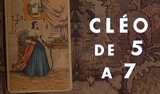
Cléo de 5 à 7 (1962) Dir. Agnes Varda
Colour is used in the stunning opening sequence primarily to give emphasis to the tarot reading – showing the import with which our heroine Cléo regards its damning predictions and the significance it will have in what follows. This cinematically playful yet thematically potent opener hangs over the rest of the picture, which is otherwise played-out in stylish black and white. Director Agnes Varda was associated with the Nouvelle Vague auteurs and, as such, was not averse to shameless stylistic flourishes.
Rumble Fish (1983) Dir. Francis Ford Coppola
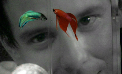
Coppola’s teen noir, presented in black and white and filled with smoke and shadows aligns itself with its hero Motorcycle Boy’s fatalistic, philosophical, literally colourless world view. Yet the Siamese Fighting Fish which fascinate him are depicted in dynamic colour, drawing attention to their figurative significance. He calls them “rumblefish”; they exist in isolation, their separate tanks prevent them from killing each other. Liberating the fish to allow them to swim together and achieve peace and freedom becomes a symbolic project; their similarity to the wild but ultimately impotent kids does not go unnoticed.
Wings of Desire (1987) Dir. Wim Wenders
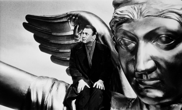
Set in Cold War era Berlin and opening in monochrome, this poignant fantasy celebrates the nuances of humanity as seen through the eyes of gentle admiring angels; who exist themselves in an observational, peripheral capacity, unseen except by the eyes of babes. These are heaven’s administrators. The introduction of colour illustrates angel Damiel’s burgeoning feelings for mortal Marion and, moreover, his and the film’s shared romanticism of the human condition. Colour appears sparingly at first, as snapshots of vitality amongst the achromatic, neutral cinematography and then it bursts out, taking hold, relegating the black and white. The initial withholding and then jubilant release of the full colour-scheme is used to emphasise the defiant beauty of this still-war-ravaged landscape and its inhabitants.