
Original poster for the Buster Keaton film The General (1926), restored and re-released by Kino Lorber.
Film critic and fashion expert Ada discusses film posters, the artistic process and creative inspiration with Dylan Haley, a Californian artist and graphic designer now based in New Zealand.
I have spoken before about the importance and role of movie posters. But what exactly makes good poster design? And where does the artistic process start? Is the public’s craving for the unique and for hand-drawn illustration starting to grow in the era of technology and digital graphic design and photography?
I came across Dylan’s work not long ago, when I found out that Kino Lorber had restored and rereleased four Buster Keaton films, including The General, unequivocally one of the best comedies of all time.
The posters instantly made me smile. Dylan’s designs are a comedic touch in themselves, fitting so well into Keaton’s unique sense of humour. There is something in that simple yet whimsical mixture of black and white stills and multi-coloured hand-lettering that frees the comic imagination. Just like the silence of the images in Buster Keaton’s brilliant comedies.
“A good comedy can be written on a postcard,” Keaton said. Dylan Haley’s designs are like a first step, or postcard if you’d like, to Buster Keaton’s comedic world. They make you start filling in the story before you even begin to watch the film – and if you haven’t already, you should start watching his movies.

Original poster for the film Private Property (1960), restored and re-released by Cinelicious Pics.
Ada: Are people still interested in movie posters? Are film posters important?
Dylan Haley: I think they are important. Even in this digital era, a poster still represents a film. The best way to see it is inside a glass case at your local theater, but even online, at a small size, it is a powerful tool to emotionally explain a film. I think a poster is a part of a film, just like an actor’s performance or screenplay is. Also, if a poster is a good one, it will have a life past the release date, and will always linger as a reminder of the film it represents.
I completely agree that the poster is part of the film. I believe poster art (just as the art of the title sequence) is a medium designed to speak to the public before the film does. How would you regard your work?
First and foremost, I take the task of honoring the film, and the job of ‘selling’ it very seriously. You can never properly sum up an entire film in one poster image, so, instead, I try to express a feeling.
There is a film critic I love, named Anthony Lane, who writes for The New Yorker. He writes these wonderful reviews that are so smart and funny. He tells all kinds of meandering side stories. He doesn’t remove himself from the picture. I suppose I try to do that, to bring my own self and imagination into the world of the film.
I view good poster design as a manifesto against the “floating heads syndrome”. What are your opinions on this technique?
The “floating head” technique is not necessarily bad, but I think it has become a term used for tacky, thoughtless poster design in general. It’s also just a way to cram all the “big name” actors onto the poster. It’s sad to see. In the old days, even trashy, poorly written populists films had wonderfully imaginative posters. There are so many B-movie posters from the ’70s, for example, where the poster is by far the best thing about the film. These days, for some reason, I think people are afraid to be creative. I also think Photoshop may have something to do with it.


Original blu-ray package design for the film Private Property (1950).
What do you think makes a good movie poster?
This is a hard question. As I said, it needs to honor the film while quickly and easily expressing a mood and feeling in an enticing way. But, really, it just needs to look good! Well, I suppose it needs to do both.
There’s a great poster by Hans Hillman for the Godard film Weekend that has no images, it’s just the words “Weekend” across the whole poster, and the letters have been warped. It’s a great poster, but I can’t imagine turning in a design like that with no visual information about the movie. I guess, for my money, I want to know a little more… but not too much!
Sometimes, a good poster comes down to just picking the perfect image from the film, which is not as easy to do as it may seem. Some images look great but they aren’t dynamic enough to carry a poster design. Every poster is different, and every film is different. A great poster doesn’t need to be clever necessarily, or subtle…. but, of course, it also can be these things. As long as there is a little bit of a love and soul in the poster, that is the most important thing.
You recently did some beautiful posters for four Buster Keaton movies restaurated by Kino Lorber. Do you think they will attract a new audience for silent cinema?
That is nice of you to say. Hopefully, they will get ME to see some more old silent film. I have only seen a few silent films, but I loved them. You forget that they are silent and just follow the story, same as you do with a subtitled film. Well, that was the goal with the Buster Keaton posters, to make them accessible to the “art-house” crowd, not just to the people who were alive when the films actually came out. Did it work? I hope so.

Original poster for the Buster Keaton film College (1927), restored and re-released by Kino Lorber.
I love film. My husband and I own a huge collection of DVDs and blu-rays. I pay attention to a DVD cover art and package whenever I purchase a new release. From my experience and from my talks with writers, I have learned that the cover of a book counts. Does a DVD cover count?
A friend just sent me a book which has won all these book awards, and I can barley open it because I can’t stand the cover. The cover is just this terrible full color photo of the author looking right at you in this almost comically serious way. As you say, good cover art can really set the tone and the mood for a film or book before it has even begun… it is part of the whole experience.
If you are going to buy a Blu-Ray, or a book, or a record, then it’s going to be living in your house with you, and if it’s ugly then who wants it around? I had another book with a book cover so bad I ended up just ripping it off! But most things have bad design. Cans of tomato sauce, cereal boxes…. when I go grocery shopping, I will always buy whichever product has the best packaging. For some reason, hot sauce products from Mexico always have wonderful designs and illustrations on them. It makes me happy to see. Indian foods as well!
Speaking of film package design, I was particularly drawn to your original poster and Blu-ray art work for Private Property and Funeral Parade of Roses. Minimalistic and effective. Where does your creative process begin? Do you watch the film first, try to understand the rhythm, the structure, the mood?
It is very important to watch the film first. I didn’t realise that in the beginning. I found that I have to really think about the essence of the film. A lot can be happening, but I need to distill it down and ask myself: what is mostly happening? What is the main point? Or what part of the film is most interesting to me?
The film Private Property has a very straight forward story line, but what makes it great is this sexiness and danger and tension, so I just focused right on that and didn’t bother being subtle about it. That film is so simple, the poster pretty much tells you everything that could be said about it.
Funeral Parade of Roses, on the other hand, is just this amazing, insane film with so much going on so many different levels with so many characters who themselves change throughout the film. But, overall, the film comes down to the warped relationship between these two characters. So I found a still of the two of them that had some weight to it, and I put this “zoom” effect on it, to communicate a twisted mood. Actually, the whole film is pretty twisted, so it speaks to the whole aesthetic of the movie as well.
Other than that, I just look at as many great posters as I can for inspiration. I have been struggling to make myself believe that I could make posters as good as some of these great old posters that I love. I think the bar is so low these days that we, designers, can get lazy and go on to just slap a title over some lightly altered photo and call it a day and the distributor will be happy. I am now asking myself, will this poster be good enough for someone to frame and put it on the wall? That is my goal. I also want to bring more hand drawn and non digital elements into my designs.
Do you think hand drawn poster illustration will see a revival in the more traditional sense? Technology has indeed changed the concept of graphic design and illustration (just as it has changed the concept of photography), but that is precisely why I believe the craving for the unique has grown stronger. Do you agree?
Yes, I do think that illustration could get big again. And I think it’s already becoming more common. There’s a craft movement happening these days with pottery, hand-made weavings and furniture and so on. People can buy “nice” things so cheaply these days, but something by hand is always so much more special.
One of the blocks is the studios, who really want their actors faces on these posters. After all, the public loves celebrities. That said, you can do a recognisable illustration of an actor. I think the real issue is just time and an extra effort to actually get your hands dirty.

Original poster for Jean Luc Godard’s Le gai savoir, restored and re-released by Kino Lorber.
Has any designer, or anyone else in particular, influenced and inspired your work?
Hans Hillmann is my favorite designer right now. Once I discovered who he was I realised he had done so many of my favorite posters. I have also just discovered a podcast about movie poster design called Poster Boys, done by two amazing designers, Sam Smith and Brandon Schaefer. It’s teaching me about about other designers, but I am also just listening to them discuss the work of designing a film poster. Being a designer can be an isolated life, so it’s great to hear other people who are in the trenches discussing the same issues.
Hans Hillmann is one of my favourite designers, too. His posters for John Cassavetes’ Shadows, for Buñuel’s Los Olvidados and for Louis Malle’s Le feu follet (The Fire Within, 1963) are among my favourites of his works. If you could choose one (or more) film, classic or new, to make the poster art for, which one would it be?
Well, my dream came true earlier this year as I had a chance to design not one, but two Jean-Luc Godard posters. I couldn’t believe my luck! Other than that, I would love to do a poster for a drugged out biker film from the ’70s,I Such as Hell’s Angeles, or a surfing film. Surfing and motorcycles are so iconic and beautiful, just to be able to work with that imagery would be great. I have been able to work on some great films lately. I feel very lucky to have the opportunity.
Could you name five of your favourite films?
Another hard question… if I was asked on another day I could have said something different. But today I will say:
La Dolce Vita, or 8 1/2 (which in my mind is somehow the same film) – Fellini
Gummo – Harmony Korine
Mulholland Drive – So good… by David Lynch, of course
Buffalo 66 – by Vincent Gallo
Innocents with Dirty Hands (Les innocents aux mains sales) – by Claude Chabrol, who is so underrated I think. This film is so trashy but also so cool and retro and French, I love it.
Honorable mention: Idiocracy – Mike Judge
Who do you wish people appreciated more?
In general? I wish people in America would appreciate that no person is an island and if everyone only looks out for themselves the world becomes a much scarier place. The lack of empathy that has come alive in recent years is just so horrible to watch. Since I now live in New Zealand I feel like I am watching a movie when I hear about what is happening in America. It’s too insane to be true. Maybe it will all make a great movie one day.
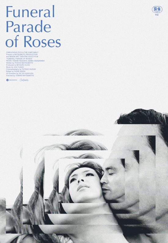
Original poster for the film “Funeral Parade of Roses” (1969), restored and rereleased by Cinelicious Pics.
posters and art work by Dylan Haley | photos courtesy of the designer | Website: Type Goes Here
This interview is published courtesy of classiq.me