
Wes Anderson’s films dispose of a rich scale of forms of expression and an astounding artistic freedom. He is the kind of director who has a true, artistic visual vision and he needs hand-picked, incredibly talented production designers who can speak the same language and bring his vision to life. This is creative filmmaking and Erica Dorn is part of the crew artists. She worked with Wes Anderson and production designer Adam Stockhausen to create the graphic elements for his latest film, The French Dispatch. It is the film in which I felt that Wes Anderson’s signature filmmaking style – the playfulness and precision with which the narratives and objects are arranged, the use of set design, camerawork, stop motion, the alternation of black and white and colour, of animation and live action, are a guarantor of authenticity of film as a work of art – seems to have reached a new level.
Erica Dorn had previously collaborated with the filmmaker on Isle of Dogs, after having worked in visual branding and illustration, but it was The French Dispatch that was her first experience of a live-action film, and “a sort of baptism of fire” in terms of graphic design. To see the range of graphic design from the beginning to the end of the film – Erica designed typography for titles and credits, as well as graphics for props and set dressing, which is to say that her work previews, informs and reflects on the film’s narrative and envelops the story that unfolds on the screen – is to realise how Erica Dorn excels at subtle variation.
I have talked to Erica about how she designs a film, what it is really like to work with Wes Anderson, what a typical workday on the set of The French Dispatch looked like and why she still loves to go to the cinema.


How do you design a film? Where does everything start, how does every little detail fit in?
As graphic designers, we’re not in a bubble of our own. We work under the direction of the production designer, who works closely with the director. We also work in collaboration with art directors, set decorators and prop designers. Together we delve deep into to real historical references, dig up and archive interesting details, and apply them to the graphics requirements that we create.
Everything starts with the script, which is broken down into a detailed spreadsheet to keep track of what graphics are required for each set, and that is constantly updated along the way.
How would you describe your experience working with Wes Anderson? And how do you attain the authenticity so important in a Wes Anderson production?
Wes keeps a close eye on everything that goes on in the production – there isn’t much that escapes his attention. Everything we do involves his input, and that can be demanding at times, but that’s what makes his movies so distinct and recognisable – there is a single visual language that permeates through all departments, and part of the job is learning to speak that language fluently.
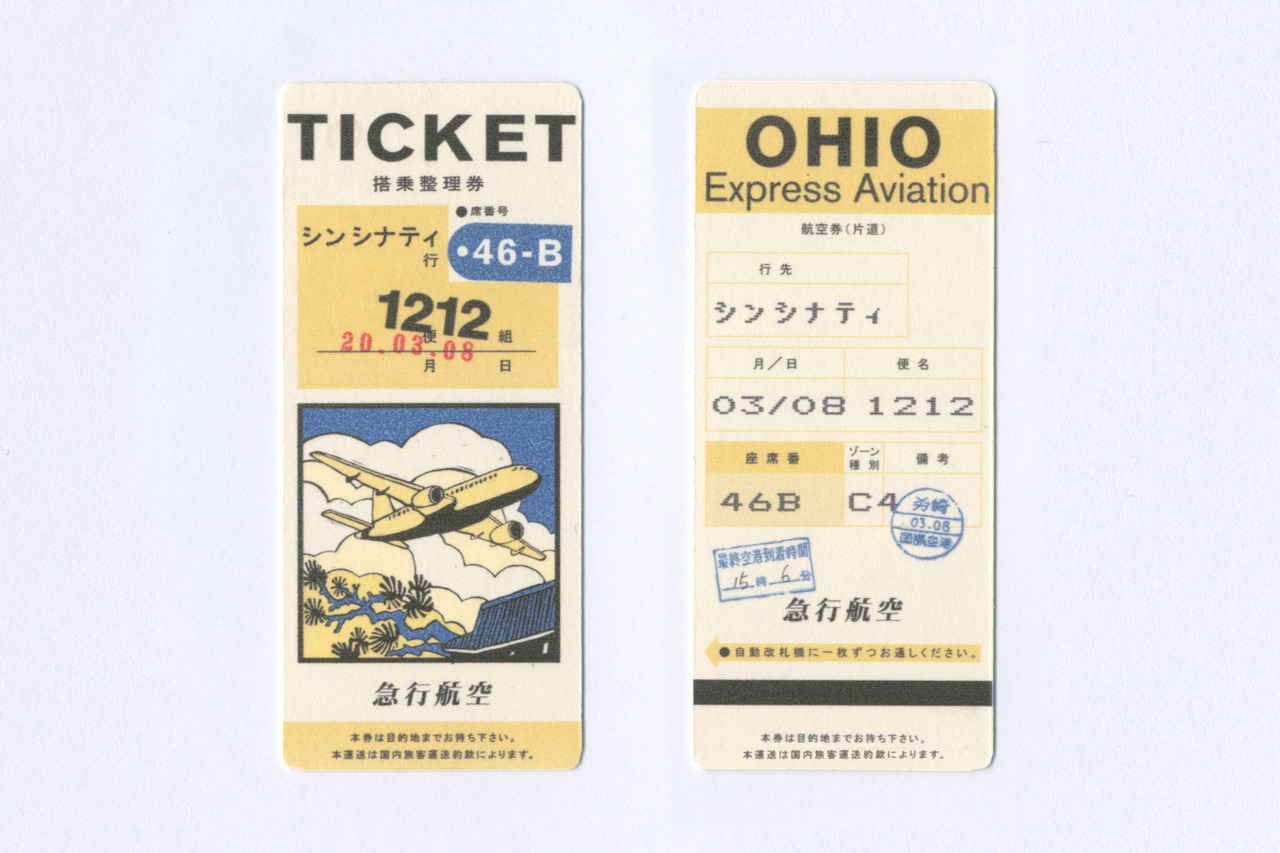
Wes Anderson has created such a unique universe in his movies and he is well known for his painstaking attention to details, therefore every lettering, every little package, every letter in his movies is an integral part of the storytelling, the props are often filmed in close-up, are having their own screen time, are characters in their own right. And viewers kind of expect that. But these things are first and foremost meant to help tell the story. Are there graphics in a Wes Anderson movie made only for the cast, invisible to the audience?
Yes, there are of course a lot of graphics that don’t get the “hero” treatment, but that are just as integral to the storytelling. Because each shot is very carefully planned ahead of time, there isn’t a lot that completely misses camera… but I would say 75% of the work we do becomes part of the textural fabric of the set. Though not completely invisible, they’ll never get a close-up or a mention in the script… These are things like wallpaper, floor tiles, background signage and trash on the ground, small engravings in a piece of machinery, and their role is to make our fictional worlds feel real, both for the actors and for the audience.

What did your work on The French Dispatch consist of? What did a production day look like when you were working on the project? Were you on the set all the time? How does the collaboration with the other departments work?
A typical day starts at 8am. During the early days of pre-production our days end around 6PM, but when production starts we are often there for 12 to 14 hours each day, sometimes even longer. For The French Dispatch, we worked in a former felt factory a short drive from Angoulême. Downstairs there was enough spaces for most of the studio sets to be constructed (there were a few locations in the town of Angoulême too). Upstairs we shared a floor with the art department, set dec and action props. It’s handy for us to be within easy reach of the shooting locations, as we often get last-minute requests to replace or duplicate something that’s needed on set.
You also collaborated on Isle of Dogs. How did that differ from The French Dispatch?
Isle of Dogs was a stop-motion animation, which takes a lot longer to film, so it was a much more drawn-out timeline. The sets were miniatures too, so we didn’t have to deal with many large-scale graphics, and a lot of what we were designing could be printed in-house. While on The French Dispatch we had to figure out how to put up a graphic that was 4x3m on the façade of a building, for example, on Isle of Dogs we were working with tweezers to produce graphics at 2cm wide, testing the limits of our in-house printers.
The French Dispatch was my first experience of a live-action film, and it was a sort of baptism of fire in terms of the density of graphics per second – thank god I had the help of the other designers on my team, some of whom were very experienced.


When did you know you wanted to pursue graphic design? How did you start working in film graphic design and what sparked your passion for cinema in the first place?
I studied illustration at University without really knowing where it would take me – I discovered that I wanted to be a graphic designer once I started working, I think because I wanted to be higher up the chain of command and creativity (illustrators often get called in once all of the creative direction has already been decided). I was working on branding for the first few years of my career, and later moved over to cinema when I answered a call for Japanese graphic designers to help out on their team. Now I’m glad to have both types of experience, as I think they feed into each other and enrich the way I approach different projects.
Do you get to keep any of the items you create for film?
Officially no, but we always need to create multiples of everything, especially if they are “used” in a scene (for example, a character rips an envelope open). One of these may or may not have ended up in a box under my desk.
If you could choose one classic or contemporary film to design the graphic props for, which one would it be?
That’s difficult to say! I am honestly in awe of the work that Territory Studio did for the new Blade Runner 2049, having had the fortune to see David Sheldon-Hicks speak about it at the same D&AD event where I was giving a talk about Isle of Dogs. The way they have managed to make the on-screen graphics feel at once technical and organic is really impressive.
I do think that type of retro-futuristic tech noir would be great fun to work on. A film inspired by Kubrick’s 2001 Space Odyssey, for example, or Duncan Jones’ Moon (the poster for that one is one of my all-time favourites), where the production design feels like how the future would have been imagined in the 70’s, which I love.

Blade Runner 2049, 2001: A Space Odyssey, these are film that demonstrate great artistic vision. Are there other graphic designers whose work you admire? Who is your biggest inspiration, creatively speaking, from inside or outside your field of work?
I’m a great fan of the work of Saul Bass, Alan Fletcher, and Ikko Tanaka, just to name a few – I think there is a special quality and energy to the age of graphic design before macs, when it was all a bit more hands-on and playful, that is quite hard to find these days.
Movies come to us, so why go to the movies? Never has this idea loomed larger than in the last years. But there are filmmakers, and Wes Anderson is certainly among them, whose films are made to be seen on the big screen. What does the movie theater experience mean to you? Why do movies still need cinemas?
I still love going to the cinema. I think it’s a nice way to immerse yourself in a story, with no distractions, and really enjoy the work as it was intended to be seen, with quality sound and visuals.
Do you have any exciting new projects you would like (and are at liberty) to share with us?
It’s strange to talk about The French Dispatch as if it was a recent project, because we actually finished shooting it more than three years ago. I’ve been really busy since then, but unfortunately can’t discuss any of the details until the films are released. Watch this space!
***
Thank you, Erica, for this wonderful incursion into the cinematic universe.


One reply on “Interview with Erica Dorn”
Wes Anderson Films have influenced me so heavily in life. Life Aquatic, Tenenbaums, Fantastic Mr. Fox, Darjelling Limited. All of them so undeniably unique and standout. Still to this day shaping audiences, and future film makers. A living legend who will be referred to in art schools forevermore.